New website theme out, I must stop making so many of them!
2025/07/01 at 8:52 a.m.
Title is pretty self-explanatory. I finished the new theme after a week's worth of work on a whole month (Took me more than it should've, but I often work in short bursts of motivation) which is all good until you realise this is like my 5th or 6th theme in slightly over a year, which is way too much for a scrappy personal website that doesn't even get updated all that much.
Now — the elephant in the room here is the fact that I can't get myself to work on something I've left fermenting for months unless I
somehow get rid of it all and start from scratch, all over again... Only to repeat said process a few months or even mere weeks later.
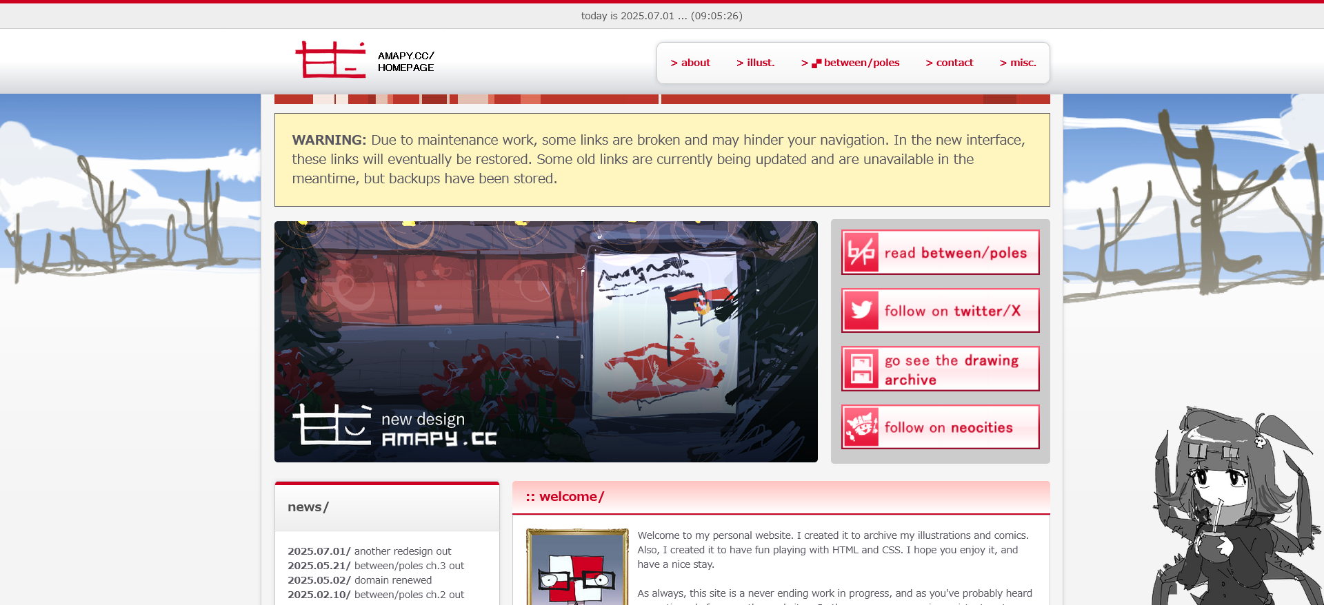 The website layout, as of writing this on 2024/07/01
So. What do I do in this case? The easy solution is to not start coming up with an entirely different site layout every time I feel like it's slightly worse but that's easier said than done so I've been left with no option but to just try and stay with it for as long as possible, and actually make a meaningful change on this place's overall structuring as it's been left untouched since the earlier half of last year... Gross!
What was added in this new layout? Not much, besides the aesthetics.
- A more stable layout: I hated working with the previous theme, not because it was ugly but rather because the structuring was set up in such a poor way that even moving or the slightest change to an image's resolution would mess up the entire thing. This new theme is built with proper div wrapping, and does not have these sorts of issues.
- A changing background: Exactly what it says on the tin. There will be an embedded image in the CSS which will change every so often — I intend for this to be change monthly, but I know I'll probably fail to do so. Nonetheless, if I do follow through on this promise, every month should see a season-themed background.
- Buttons, working buttons!: Right now the only available "specimen" is at the home page, and doesn't serve a purpose so far, but I'll be moving on from the usual ugly red padding to functional buttons that look like such, and even have their own transitions when hovering over them. The only issue with them is just how buggy they are with rescaling and line break hijinks, which will mean these buttons could be remade into their own divs instead of links with their own classes.
A todo list has been added to the main page to
(hopefully) remind me of what to add next, to make this one actually last. I'm not putting a full on ban on modifying this place in any shape or form, but rather just putting a stop to the neverending churn of worthless and ugly themes which don't even see the luxury of being adopted sitewide despite all my claims of doing so.
Last but not least, what's next? From my previously mentioned todo list...
- Dark mode: I was asked for this once and while I do want to implement custom themes (or a variety of thereof) I'm not sure if this is actually needed, so it's low on my list of priorities...
- Font resizing buttons: These will be added at the top right of every page, and will come in just two options: normal and large. I'm pretty sure there aren't any grandmas hopping on "amapy dot cc" but I do know of people who are annoyed at the sight of a website with text smaller than half the screen's height, so this is a form of appeasement in a way.
- Archive gallery, with descriptions: This is the heaviest one so far, and implies a lot of work. Might not do it, but it's very tempting... The only issue with this is that only pieces after this year will have actual to-date descriptions in them, as any description done in, let's say — a drawing from October 2023 would only have something written after the fact. Still, I'll add a date to each comment as to not give off the impression that I was thinking on exactly this thing or that when I was creating this piece, and that it's just a mere approximation.
- A functional menu button on mobile: Usually, the menu bar that's often seen on desktop just sort of wraps around in mobile, even if it's a bit messed up. And although this is a poor solution, it's just barely good enough. Now, on this version I didn't even get the chance to do that, so I'll have to learn how to add a button with an unique interface on mobile. Most people go through the Internet using their phones (which is probably not true on Neocities and similar ilk) so this is an important one, and quite high on my priority list.
- Sitewide theme adoption: Again, I'll set my sights on the things you can reach from the homepage + the not_found page for now. I'm thinking on making a separate theme for between/poles things, since I feel this doesn't fit so well for the comic, and it needs a slightly easier layout to read.
That's it for today, have a nice day.